In the previous post, we look at the basic design principles like balance, proportion, sequence and consistency in document design. Today, we look at three other factors, alignment, proximity, contrast and in good document design.

ALIGNMENT
According to Hortin (2009), alignment creates a sharper, more ordered design. Aligning elements create a visual connection with each other. It tightens design and eliminates the haphazard, messy effect which comes when items are placed randomly. Aligning elements which are not in close proximity with each other, helps to provide an invisible connection between them.
 |
| Grouping Similar Elements Together |
PROXIMITY
Proximity is define as the grouping of similar elements together or in close proximity. This ultimately create a relationship between those elements. It also provides a focal point and can give the reader an idea of where they should start and finish reading. Proximity does not mean that elements have to be placed together. It means they should be visually connected (Hortin 2009).

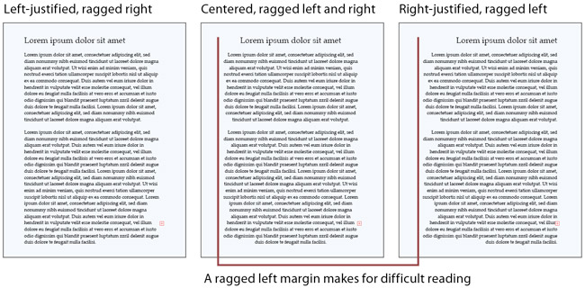
CONTRAST
Kyrnin (2013), defines contrast as the accentuation of the difference between elements in a design. While most of us think that contrast only apply to colours, it actually work with any design elements. However, it is also important that when we apply contrast, the difference has to be obvious.
Hortin, A 2009, 5 Basic Principles Of Design, viewed 31 January 2013, <http://maddisondesigns.com/2009/03/the-5-basic-principles-of-design/>
Image Source : <http://webstyleguide.com/wsg3/figures/8-typography/8-6-650.jpg>
Image Source : <http://dbram.wikispaces.com/file/view/Proximity.jpg/321603324/467x353/Proximity.jpg>
Kyrnin, J 2013, Contrast - Basic Principles of Design, viewed 31 January 2013,
<http://webdesign.about.com/od/webdesignbasics/p/aacontrast.htm>
Image Source : <http://micaelacarter.files.wordpress.com/2009/07/rcpfig_4-contrast.gif?w=500>


